
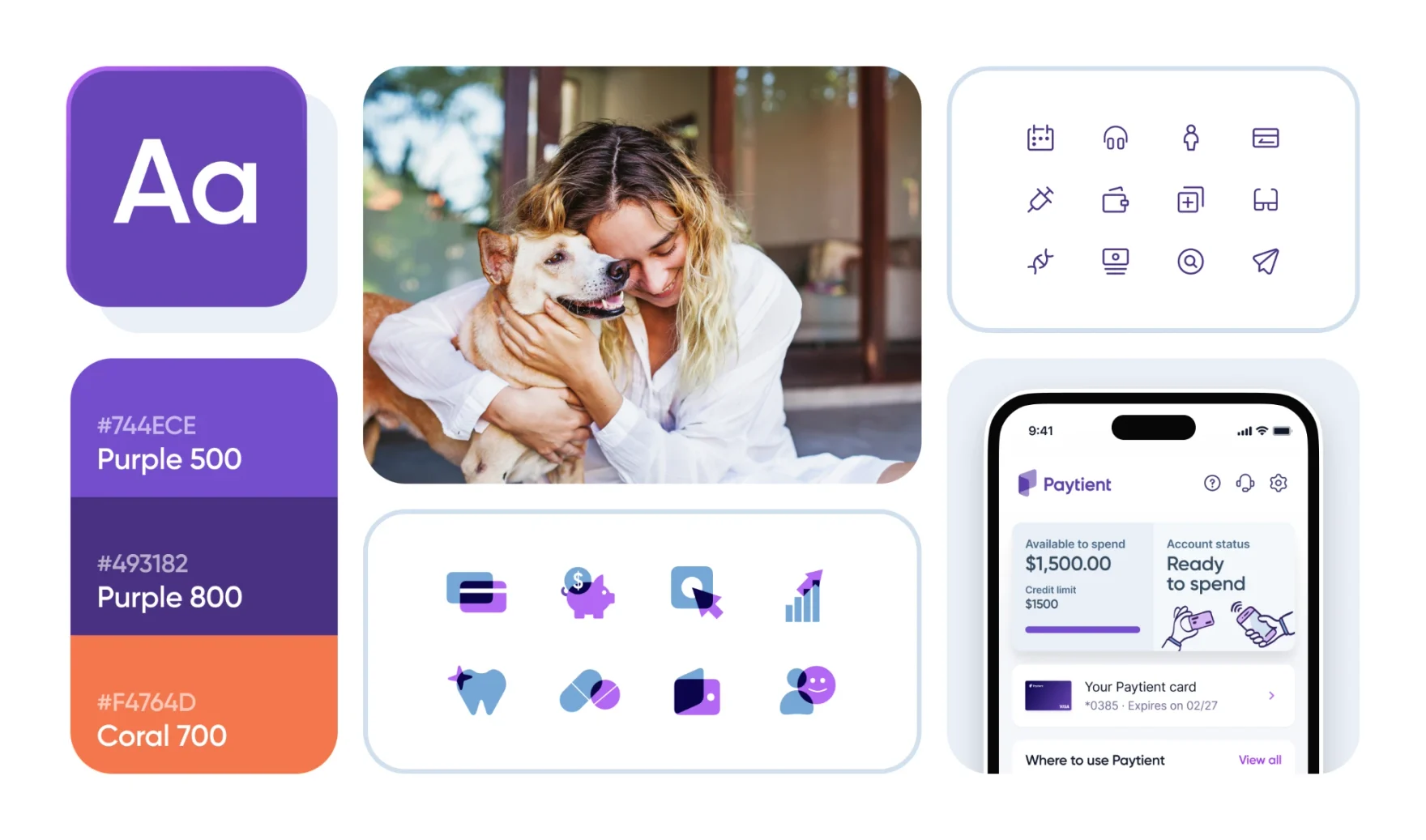
Building the design foundation behind 1M users
Taking Paytient from a small MVP to a mature, full-featured product.
Summary
- ServicesProduct design, Design systems, User research
- IndustriesHealthcare, Fintech
- DateNov 2021 - Jun 2025
I joined Paytient as its first full-time product designer, when the product was a basic MVP, and spent nearly four years turning it into a full-featured, mobile-first platform. I built the design system, ran user research, took the product through a company rebrand, and helped grow the design team from 2 to 5 people.
Results
-
100k → 1M
Eligible users
-
x6
Monthly card payments
-
5 → 2 mins.
Time to full onboarding
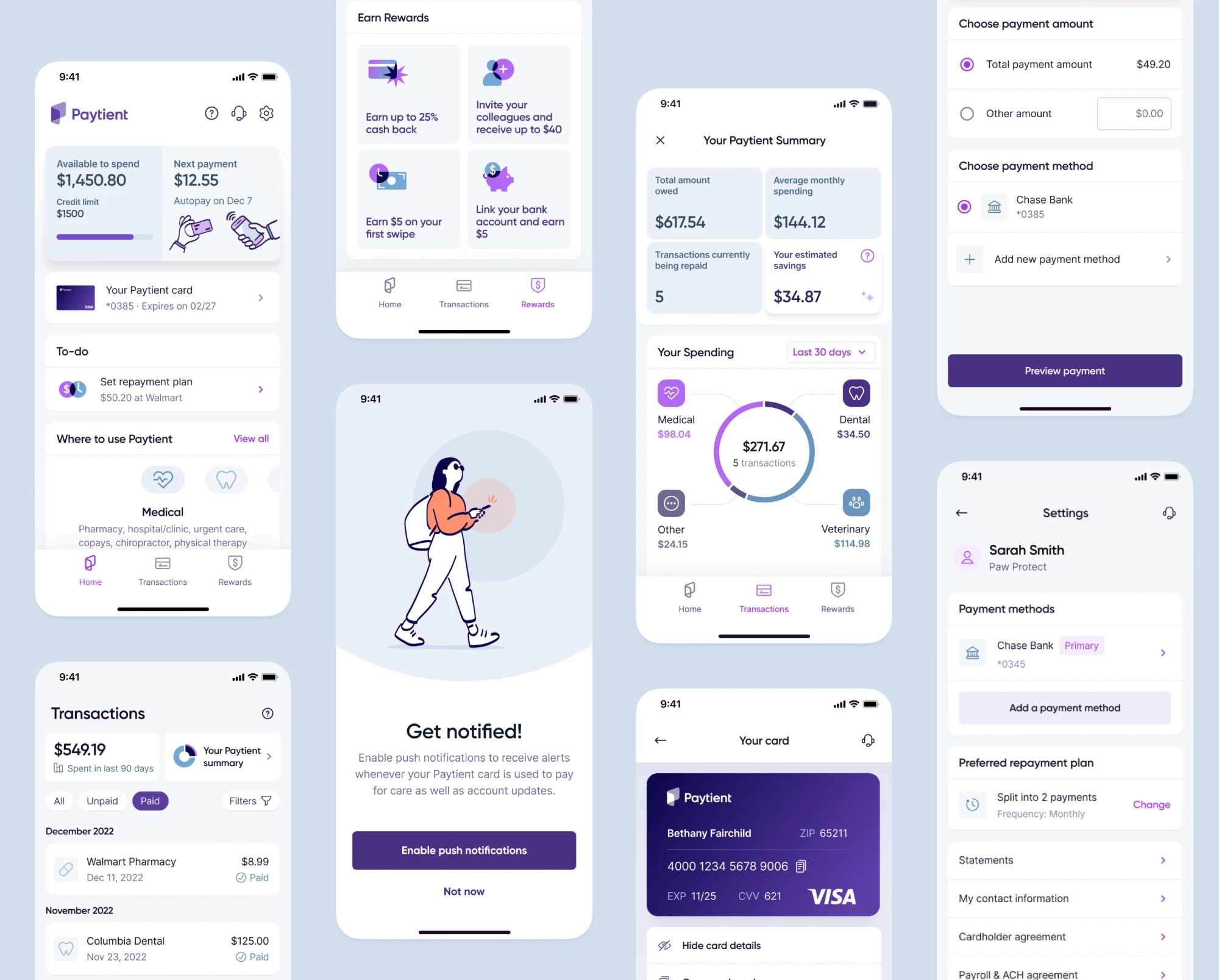
Timeline
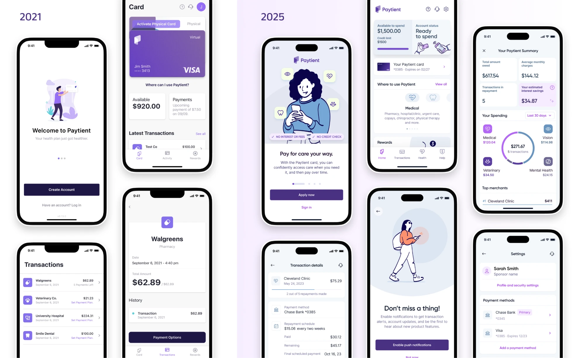
- Late 2021Joined as employee #33. The product was a basic MVP with minimal branding and generic UX.
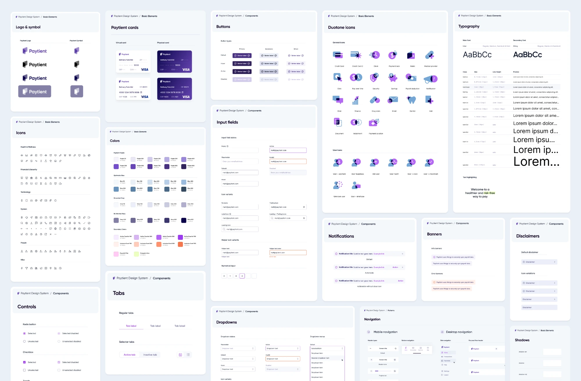
- Early 2022Designed and implemented Paytient's first design system.
- Mid 2022Ran the first foundational user research and led the first in-person product offsite.
- Late 2022Supported a company-wide rebrand and updated the design system and every product visual to match.
- 2023 - 2025Grew the design team from 2 to 5, expanded the design system, and launched new features and products.
The challenge
When I joined, the product had basic functionality and a sparse design language and brand identity. Paytient is a Health Payment Account (HPA) that employers or health plans give to their members, so they can pay for care over time without interest or fees. Three things needed doing at once:
-
Expand the product's features while consolidating its visual language.
-
Build a scalable, well-documented, mobile-first design system.
-
Set up design workflows that would make scaling and collaboration easier.
That was a lot for one product designer. The only other person sharing the work was a UI designer and front-end developer, and he left a few months later.
Design system
I'd built design systems at RMS and knok Healthcare, so I knew we needed one to grow in a structured way, on both the design and the implementation side. I also knew a growing system is laborious to manage, because any change can break existing designs. We settled on three principles to keep it manageable:
-
Mobile-first
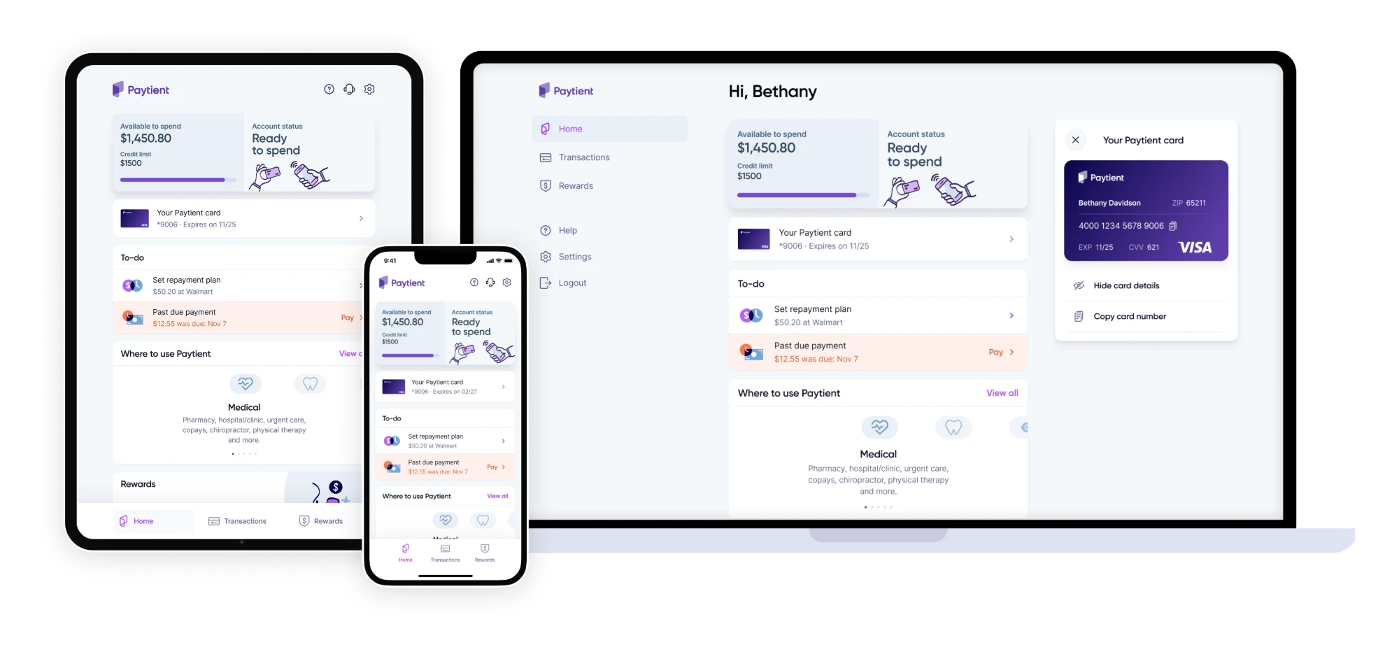
Paytient is a mobile-first product, so the system follows the same rule. Clear rules for how mobile designs adjust to larger viewports cut a lot of design and development complexity.
-
Purposeful minimalism
We kept the system lightweight to limit design debt, adding only the styles, components and patterns we needed. Before adding anything new, we asked how many other places it would be useful and whether an existing component could do the job.
-
Consistency before style
We kept one visual language that followed Paytient's brand and matched the coded components.
Working with engineering
Front-end engineers built a repository of coded components that matched the system's components and patterns. They also helped us set practical naming conventions for design tokens: margins, corner radius, font sizes and colors. Consistent token names kept design and code closer together, removed ambiguity, and made the system easier to maintain.
Expanding to desktop
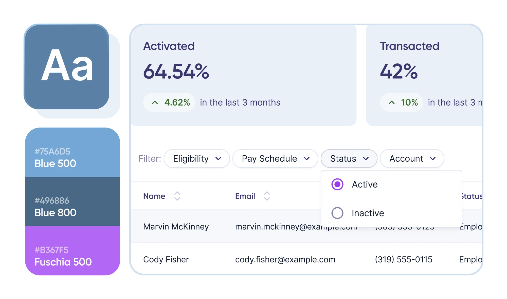
What started as a lightweight library for the mobile-first product soon had to cover new products. The biggest was the Paytient Operations Portal (POP), a desktop-only management dashboard with different requirements. I created a separate library for POP. Most styles and components still came from the core system, and POP added desktop components like tables, advanced filters and metric cards.
Product goals
With the foundation in place, we could finally expand the product. Our goals came from business needs and customer feedback. Priorities shifted over time, but three stayed constant:
-
Increase onboarding completion
Simplify the flow and build trust with members earlier.
-
Increase card utilization
Turn the home screen into a hub that explains how the product works, announces new features and reminds members about pending items.
-
Reduce delinquency
Surface early payment and past-due options throughout the app so members repay on time.
How we worked
Paytient's development process was an adaptation of Scrum, and we adapted the design process from that to fit how design work actually runs. Design sprints overlapped with development sprints, so we could share certain ceremonies, and we kept adjusting the process to serve the team.
User research
We ran in-person and remote research throughout. Two in-person rounds with real members, in New Orleans (June 2022) and Columbia, Missouri (October 2022), were open conversations about how people used Paytient day to day, what got in their way, and which features mattered. Watching their reactions as they used the product let us test larger features and app redesigns in a real setting and uncover needs we hadn't spotted.
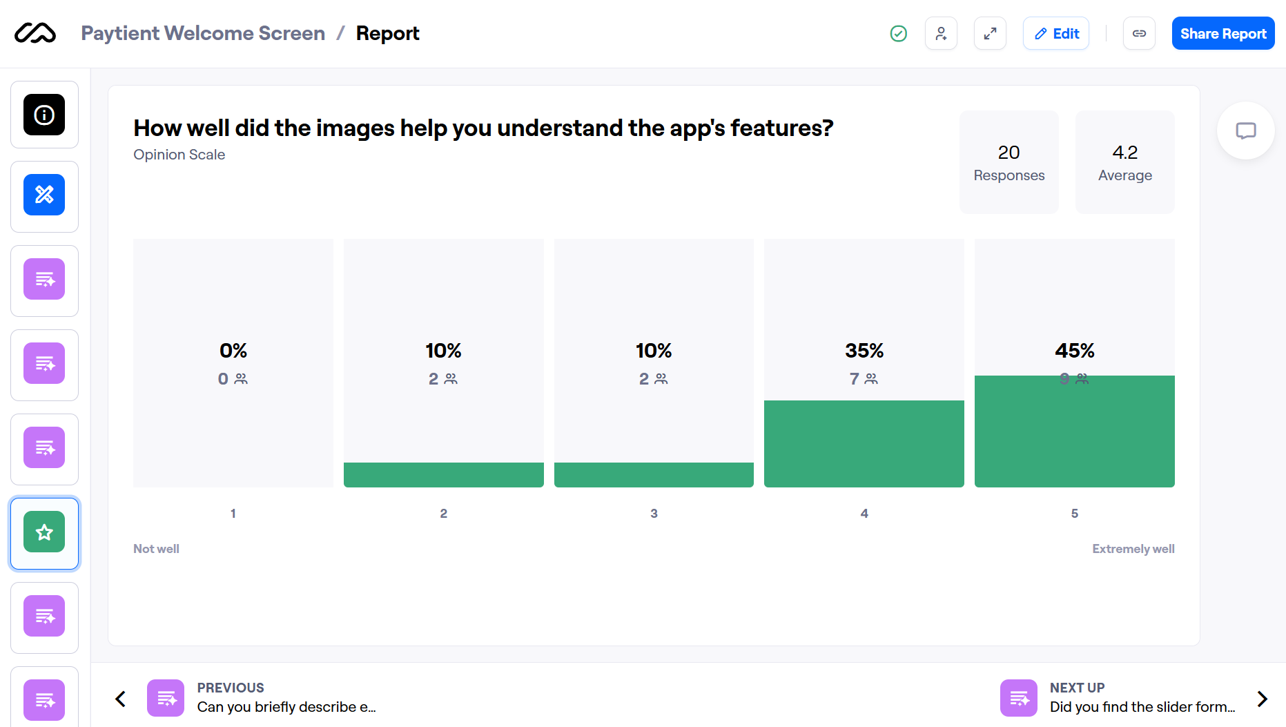
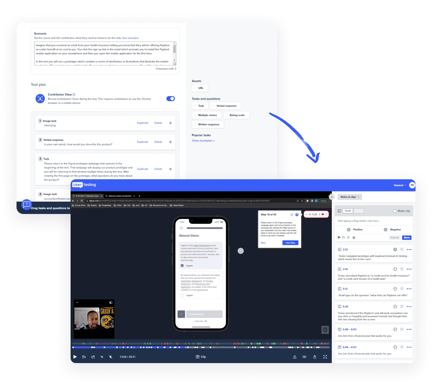
For targeted feedback on specific features, we used UserTesting.com and Maze. Participants completed tasks or moved through prototypes while we collected quantitative and qualitative data. It was faster and cheaper, and it reached more people, though we had to explain the product well to testers who had never seen it. We iterated quickly and caught pain points before launch.
Figma workflow
After a few iterations we settled on two kinds of files. Work-in-progress files were for design, so we could explore and experiment freely. Dev-ready files were for development, and only finalized designs moved into them, so engineers saw only what was ready to build.
Growing the team
As Paytient scaled, I helped recruit and onboard new designers, taking the team from 2 to 5. I established the documentation and processes that let them contribute to the product, encouraged open, constructive feedback between designers, and made sure everyone felt comfortable sharing ideas. That moved us from one solo designer to a team working together.
The rebrand
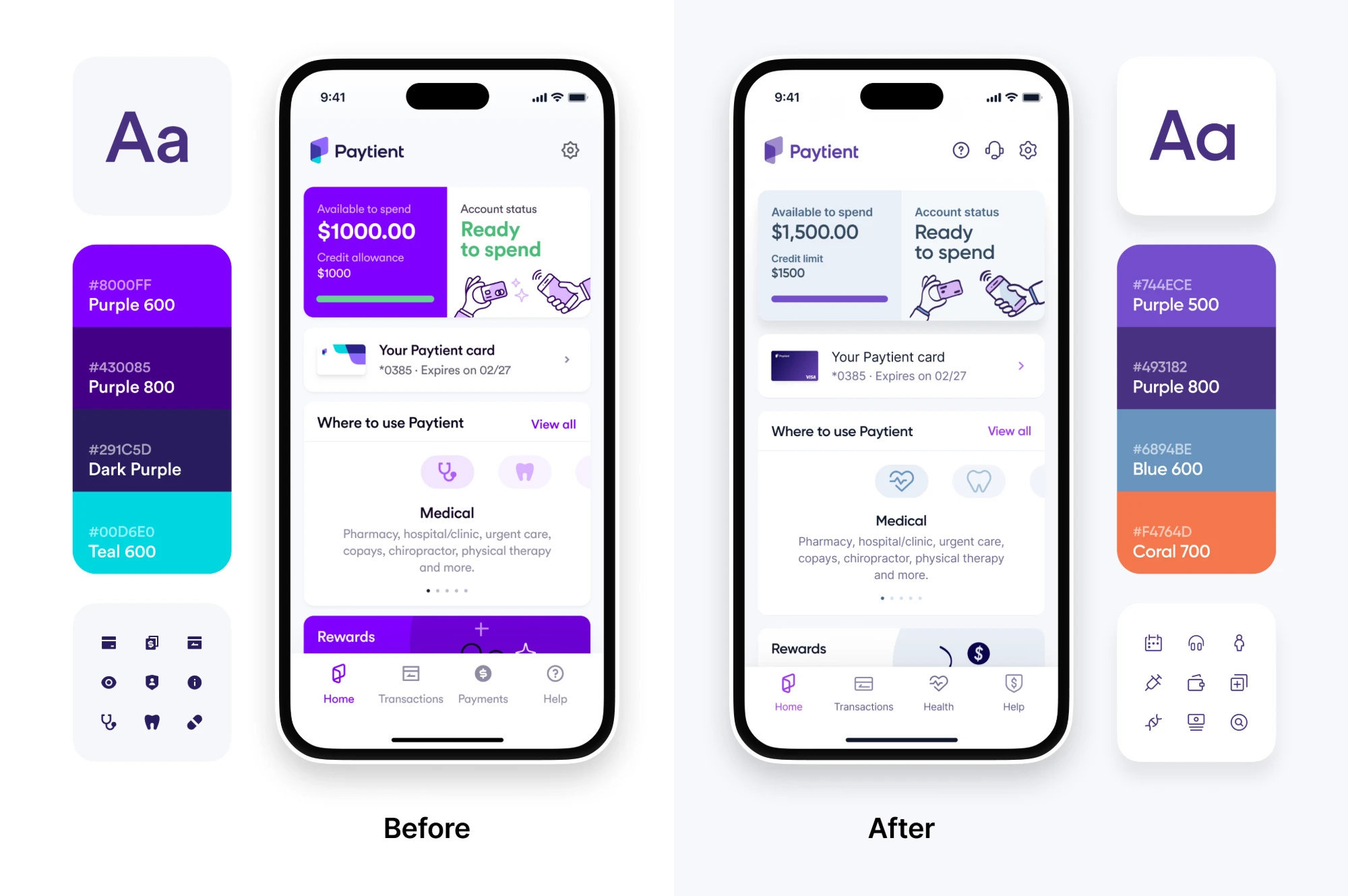
In October 2022, Paytient's marketing team announced a brand refresh. The saturated purple and fluorescent green went out, replaced by a softer dark purple and blue. Circular, our only font, gave way to Gilroy and Inter. The product had to follow.
We started with an audit, then systematically updated the global design tokens and components. Because the system was flexible and well documented, the transition was smooth, and we shipped the refreshed product without disrupting our workflow. That is Paytient 2.0, and it still looks that way today.
Outcomes
- The design system let us iterate quickly and kept the experience consistent as Paytient grew.
- Agile workflows and documentation helped new team members get up to speed and supported cross-functional work.
- The refreshed identity made Paytient feel like a trusted, modern option in healthcare fintech.
What users said
★★★★★
"Account was very easy to setup and website is simple to navigate."
★★★★★
"Setting up the card was a breeze, and I was impressed by how quickly I could access funds for my healthcare needs."
★★★★★
"Easy to setup and easy to use."
★★★★★
"Super easy! And easy to navigate the app!"