
Creating the Radius Design System from scratch
Creating RMS' design system with a three designer team at Nagarro.
Summary
- ServicesUX/UI design, Design systems, Illustration, Documentation
- IndustriesRisk management, Insurance
- Date2019
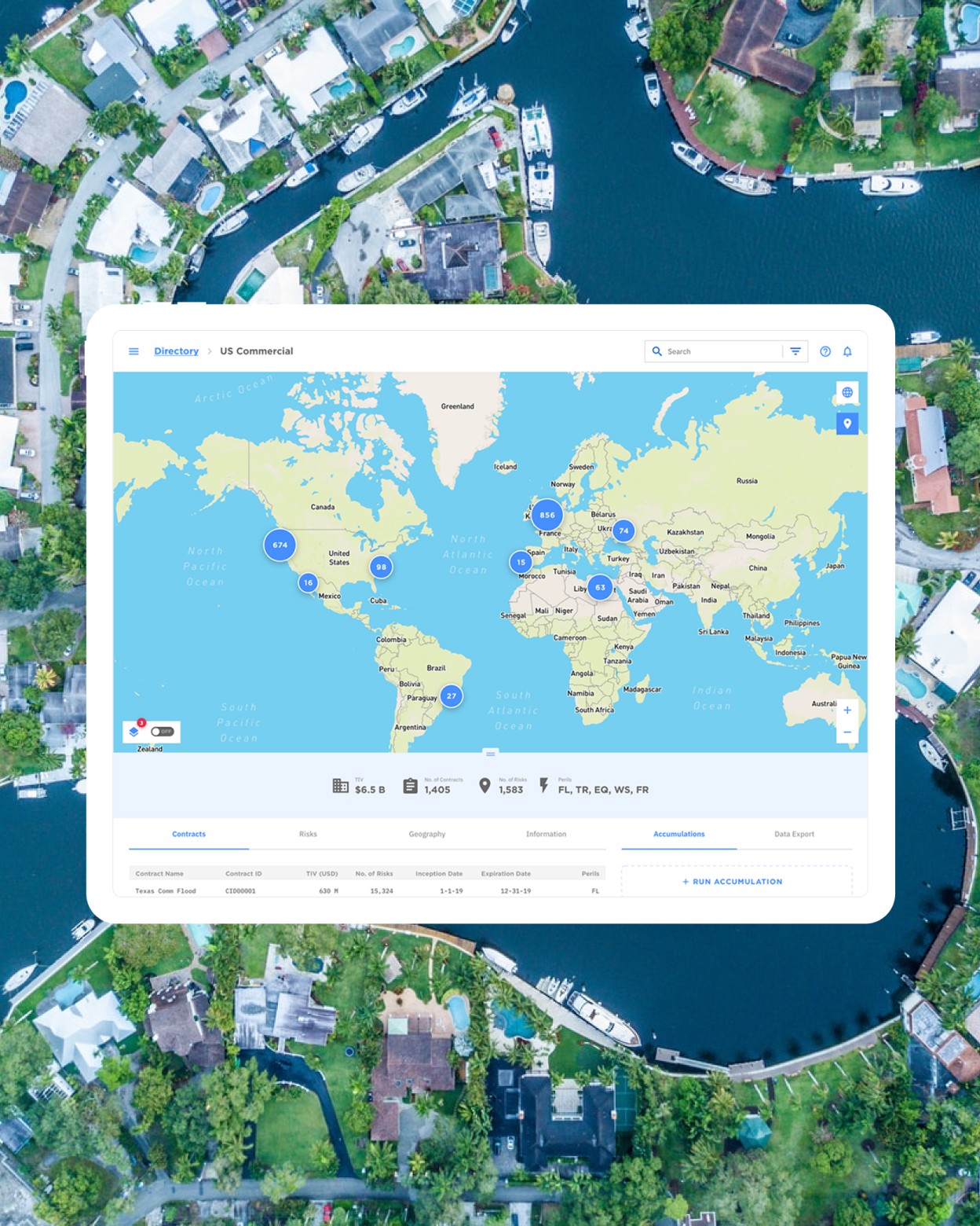
At Nagarro Product Studio, I was one of three designers building a design system for RMS (Risk Management Solutions), which makes risk analysis and insurance products. RMS's products had grown fragmented, with inconsistent patterns across teams working in silos. We built Radius from their existing layouts, added the components that didn't exist, and opened it to other RMS designers.
Results
-
5+ products
In under a year
-
30%
Prototyping time saved
-
$50k/release
Saved on UI clean-up
The challenge
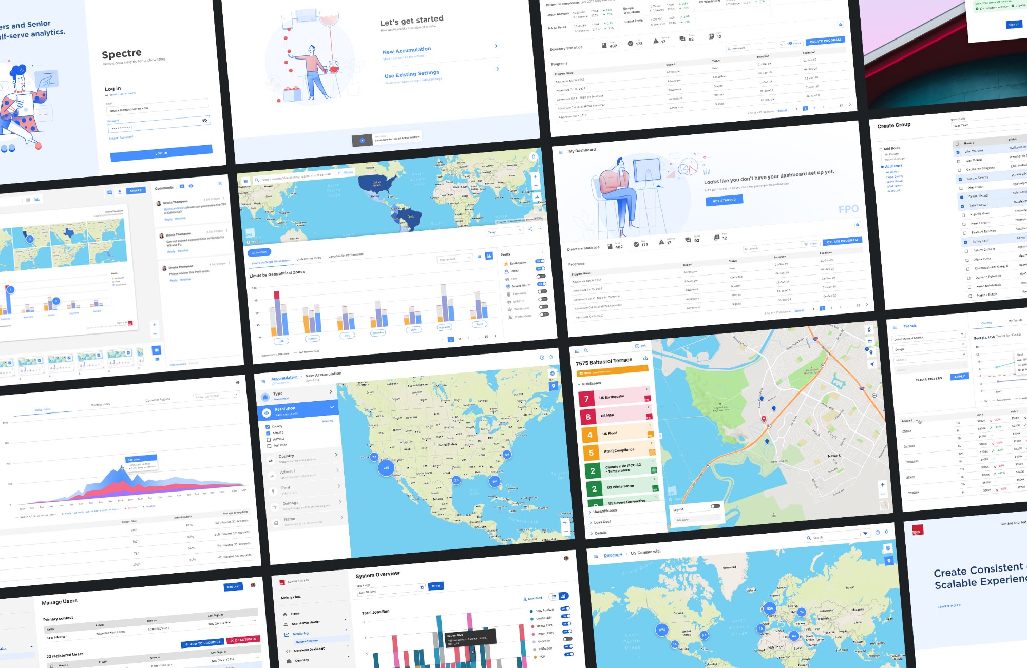
As RMS's suite of products grew, the user experience became fragmented. Inconsistent design patterns and visual language were on the rise. Product teams worked in silos, so it was hard to keep a coherent brand and interface.
The challenge was to build one design system that could scale across teams and products, for faster ideation and higher-quality user experiences.
System goals
-
Unified design language
The goal was to create beautiful and accessible products with one design language.
-
Lower implementation effort
Components had to be reusable and adaptable to any platform, to reduce the work of building them.
-
Desktop-focused
To be as efficient as possible, we narrowed the initial scope by building the system for desktop first.
The system is built around three pillars to achieve those goals.
-
Design principles
A shared set of criteria to guide design decisions across all products.
-
Style guide
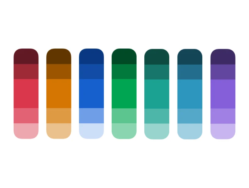
A reference for brand identity, including color palettes, typography, spacing and iconography.
-
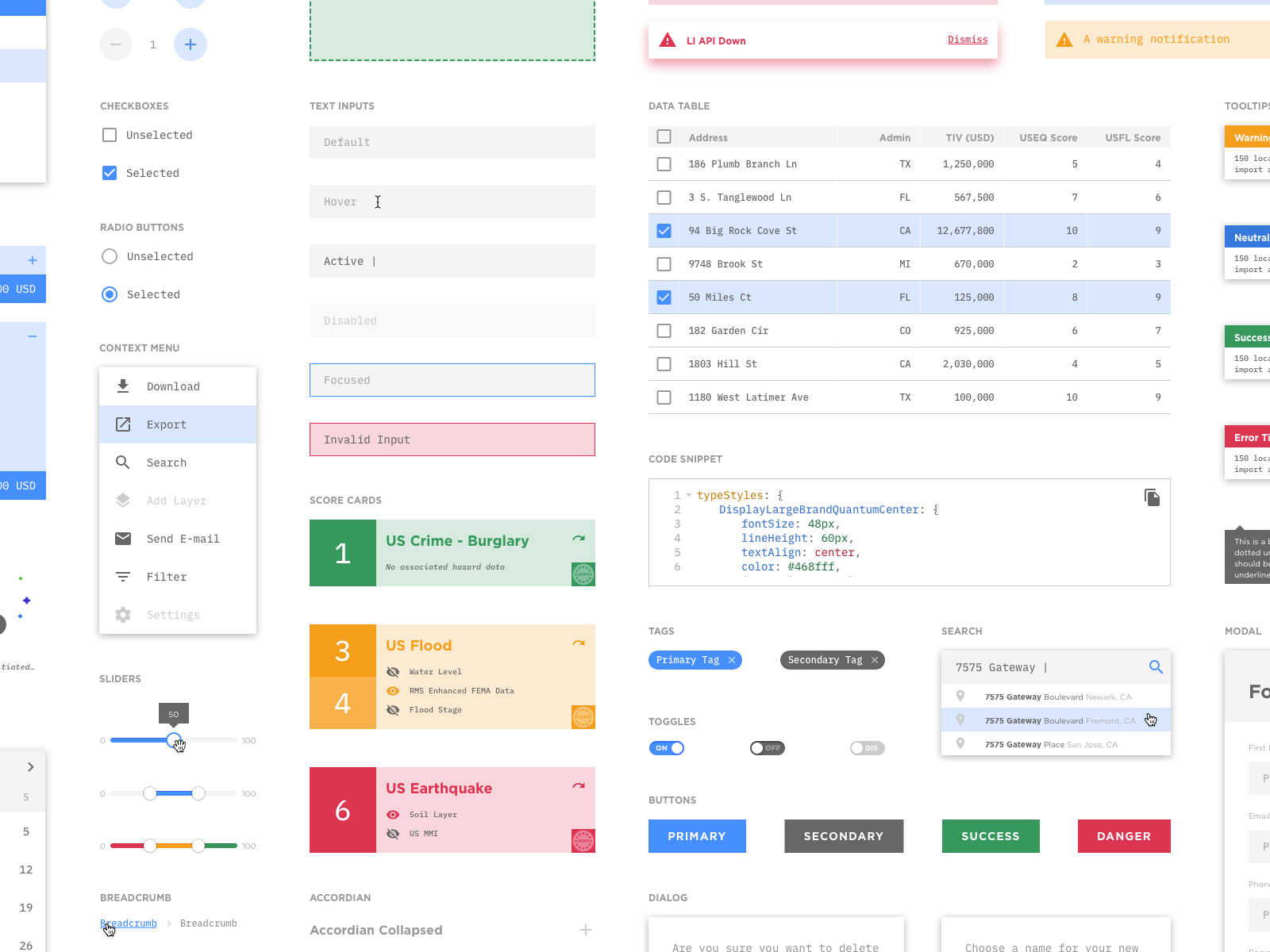
Component library
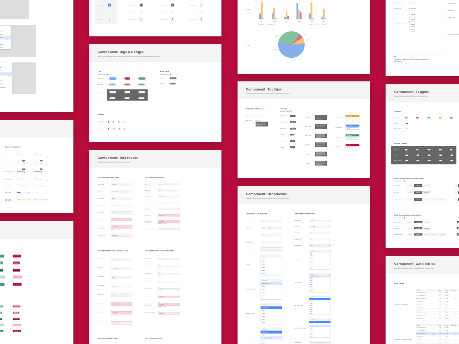
A glossary of modular, reusable interface components that scale and adapt to new products.
Implementation
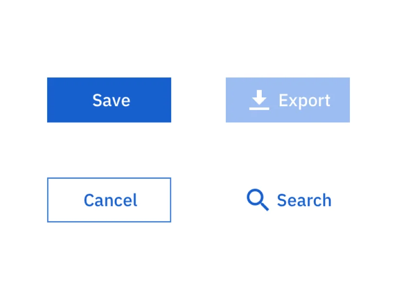
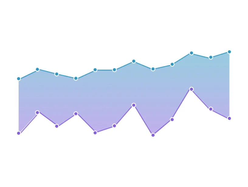
We built the system with atomic design principles. We started with foundational styles (typography, color and spacing), then built up to basic and complex components.
We aimed for three qualities: fluid (scalable and adaptable), accessible (usable by all) and consistent (a unified look and feel).
We designed pixel-perfect, straightforward components so RMS designers and developers could focus on the product experience, not on spacing, color or type values.
Design-development bridge
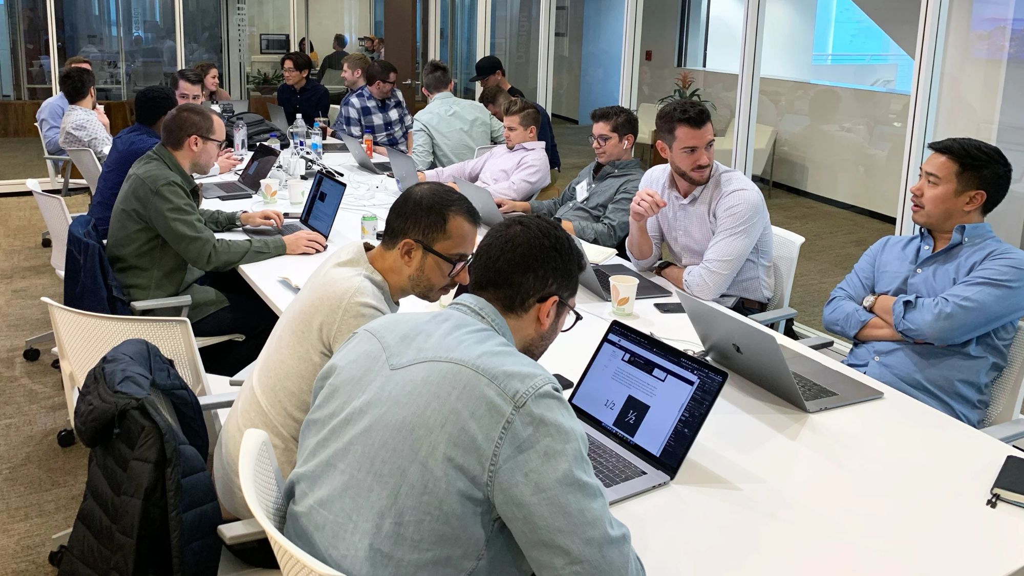
We partnered with front-end engineers from the outset. Together, we created a repository of coded components that closely mirrored the design library.
We also set clear naming conventions for design tokens like margins, radii, font sizes and colors. That carried design intent into development with less friction and faster delivery.
Documentation
To drive adoption across all RMS teams, we documented every resource, guideline and process in Zeroheight. That lets everyone contribute to and maintain the design system.
We used Jira and Confluence as the single source of truth for ideas, proposals, issues and bugs.
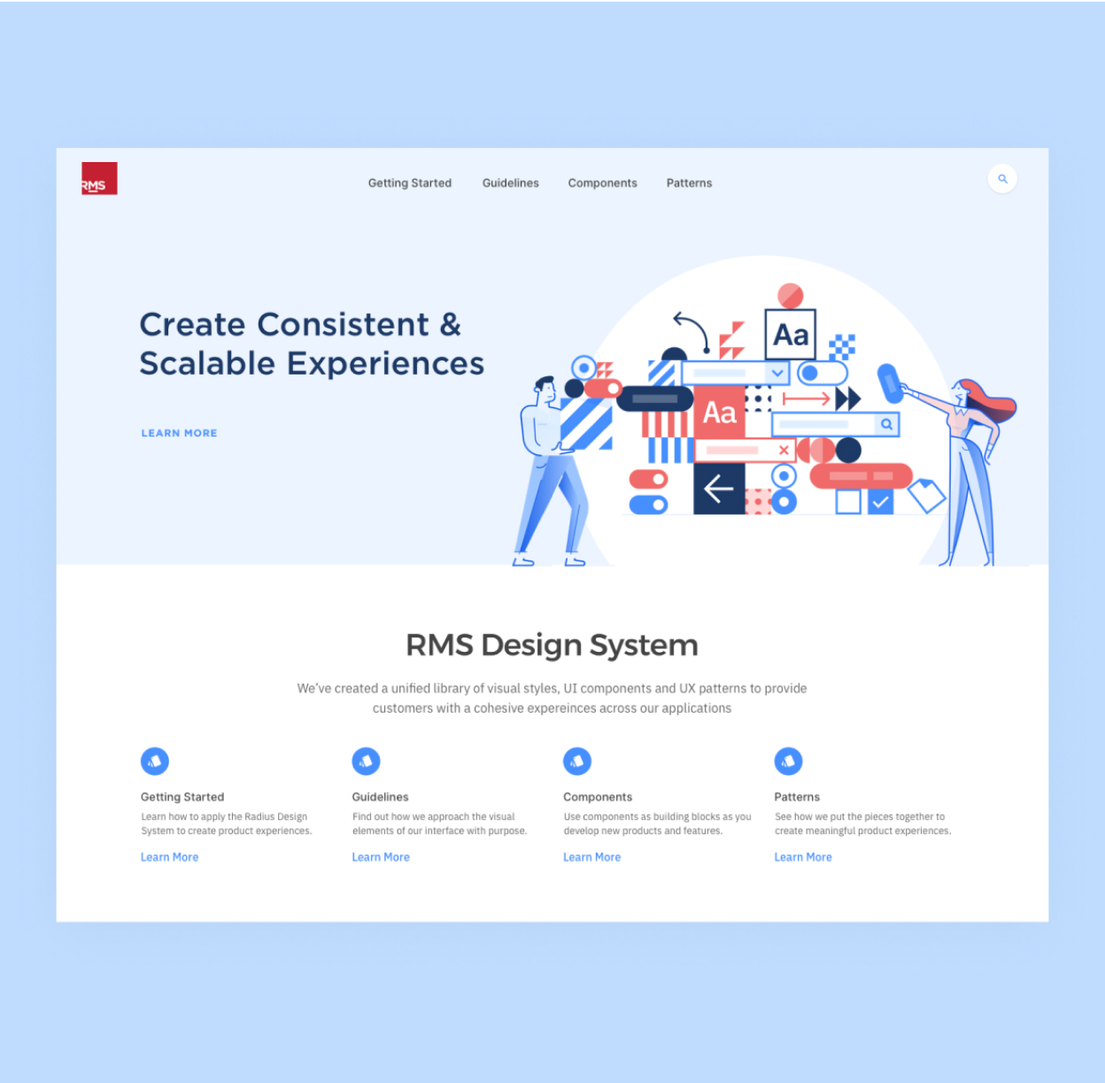
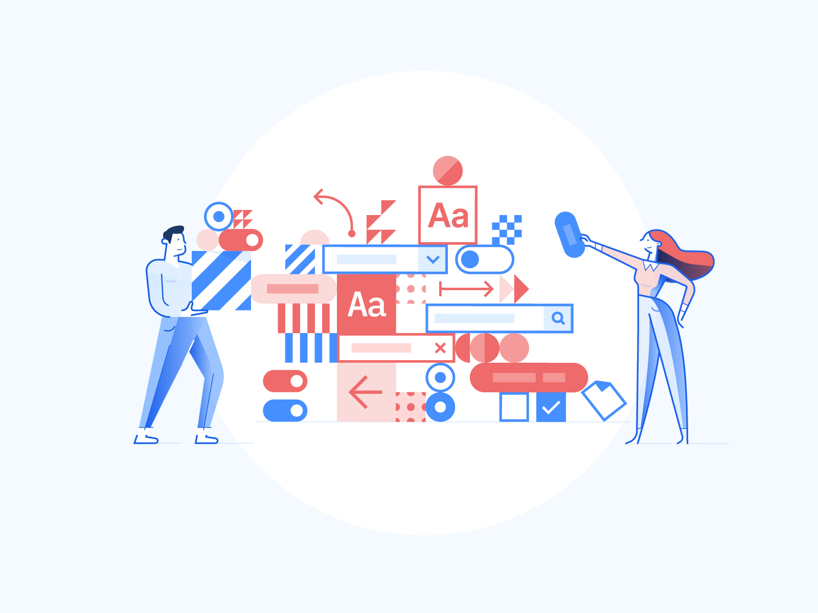
Illustration library
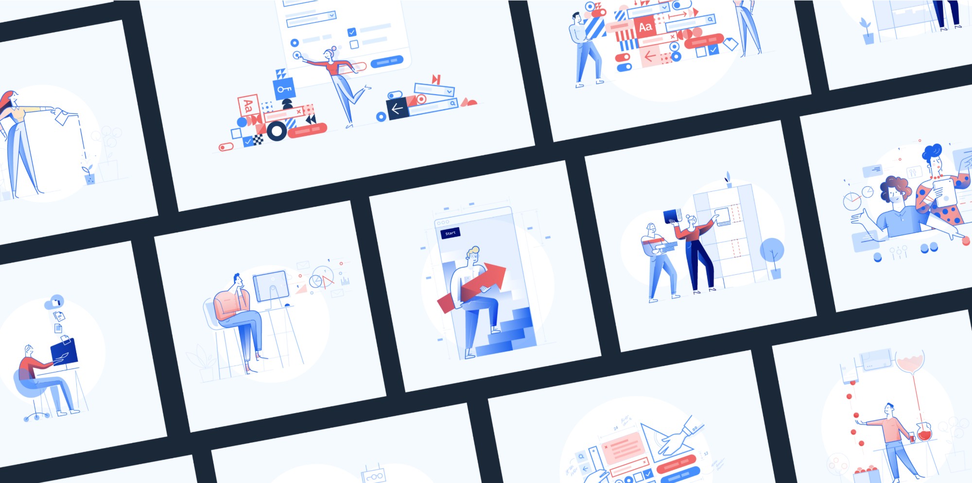
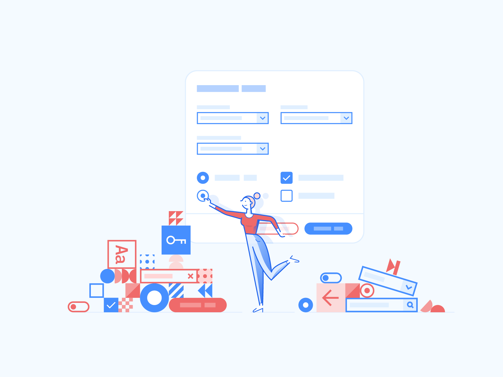
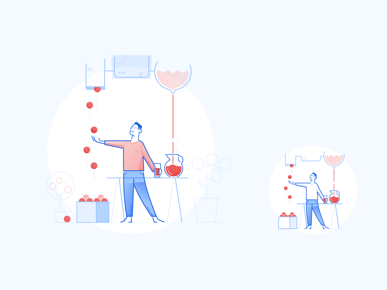
I started the RMS initiative to create custom illustrations that matched the Radius style guide. The goal was to bring humanity and a sense of ease to RMS's products.
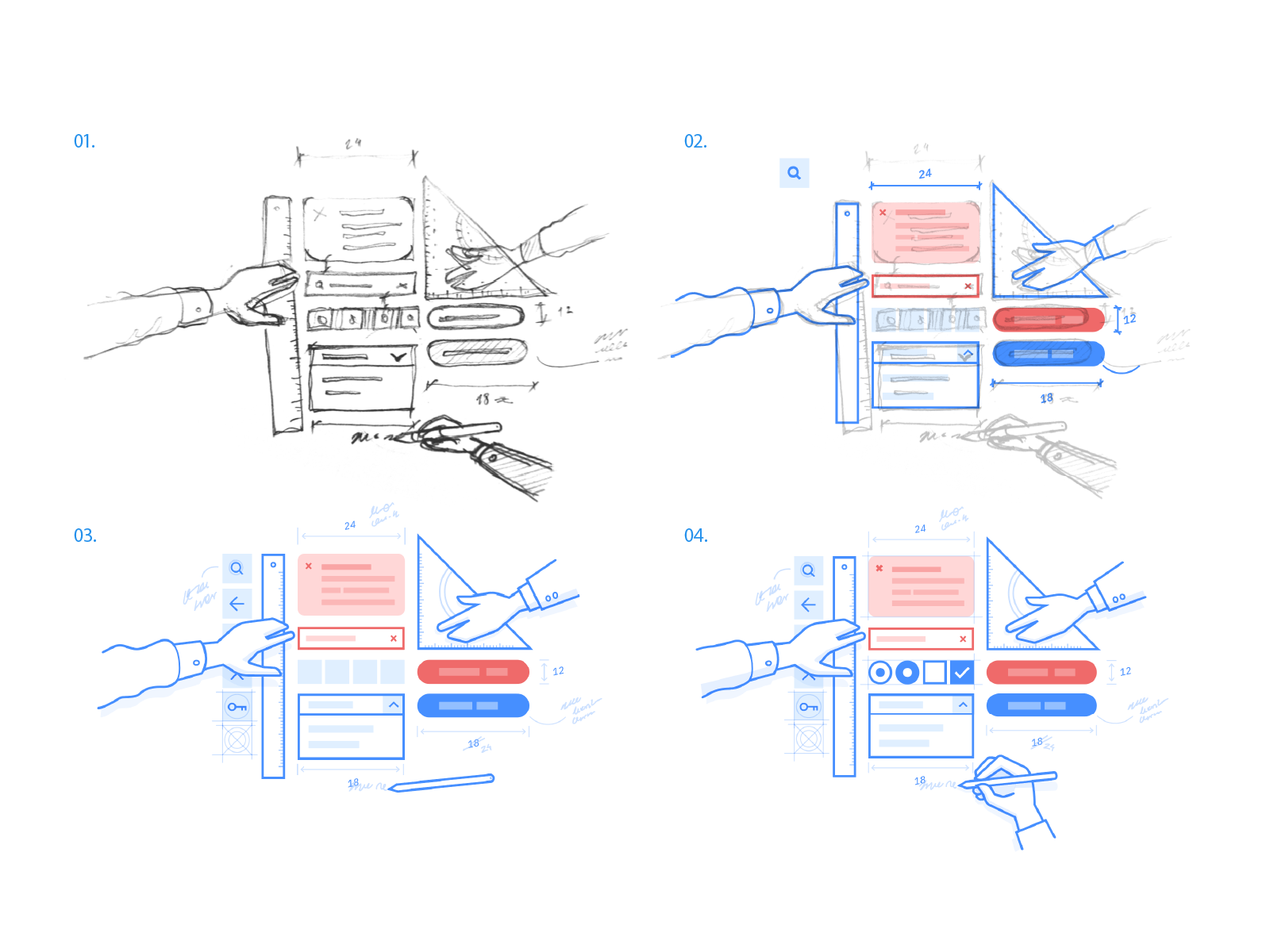
Another designer and I created the style, set detailed guidelines and produced a series of requested illustrations.
Illustration principles
We set principles for the setting, environment, characters and concepts to convey. Illustrations show the typical RMS customer environment, an office or meeting room, with characters dressed formally and a mix of races and genders.
Illustrations should support the workflow a user is trying to complete. They can simplify or use abstract notions to communicate complex concepts from that workflow.
Outcomes
- Unified UI components across all RMS products.
- Improved accessibility and usability for end users.
- Easier onboarding for new designers and developers.
- Consistent brand presence across platforms.